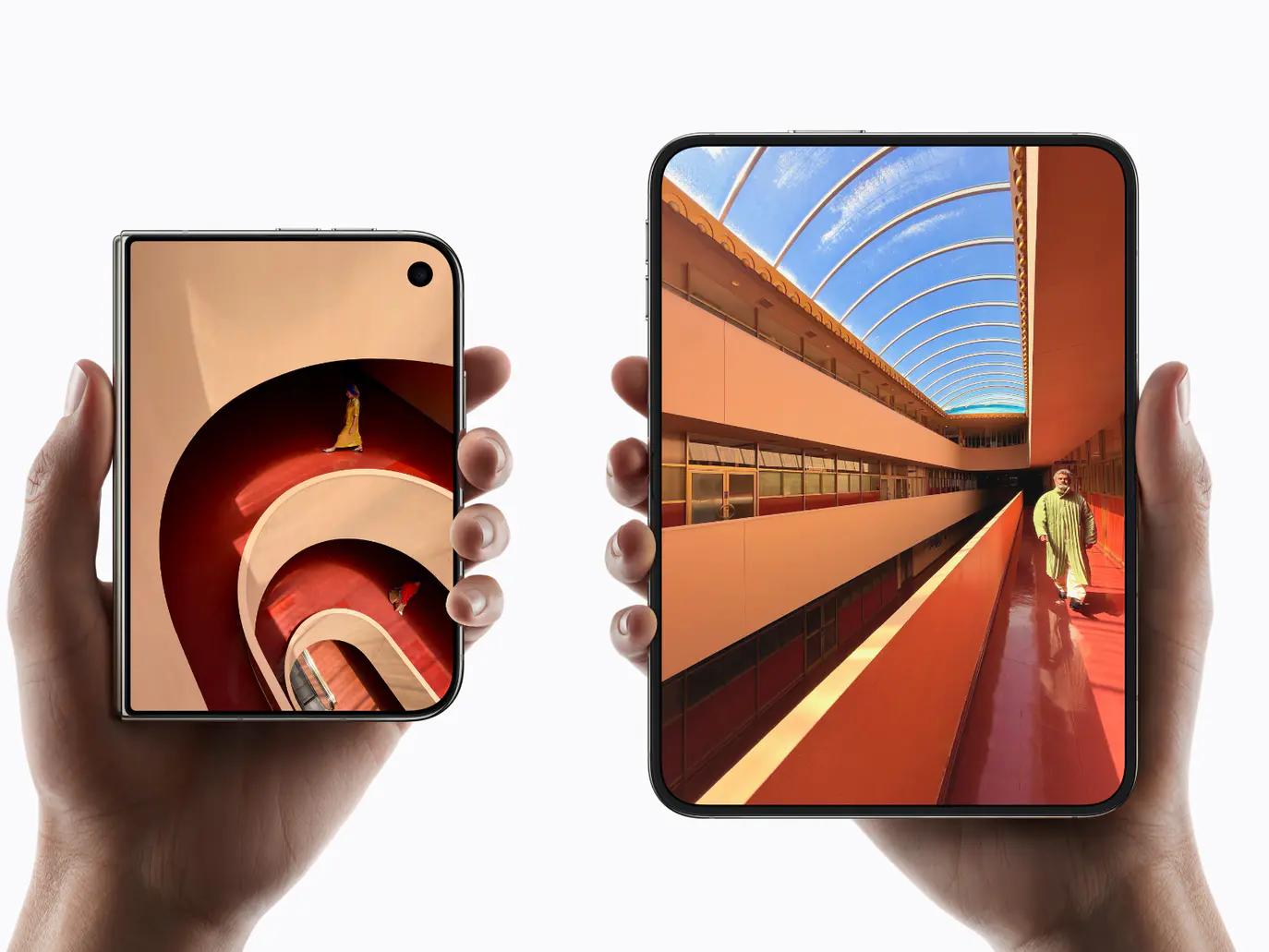
Apple has long possessed a remarkable ability: taking concepts that have existed in an industry for years, reimagining them through its own unique lens, and then schooling the entire industry on how such products should be designed. The iPod, iPhone, and AirPods are all prime examples of this.
As a designer who uses both a foldable phone and an iPhone, I was particularly eager—prior to the launch of the iPhone Duo—to see Apple “teach the industry a lesson” on foldable user experience design on September 10th (Teachers’ Day). However, after the launch took place and I saw the hands-on impressions from the media, I began to feel that the iPhone Duo wasn’t quite as impressive as I had anticipated.
I feel compelled to speak my mind and share the questions that have been building up in my mind before the device officially goes on sale.
First, let’s look at the brand-new app layout system.
Compared to a standard iPhone or iPad, the Duo introduces an entirely new “app layout system” on the software side.
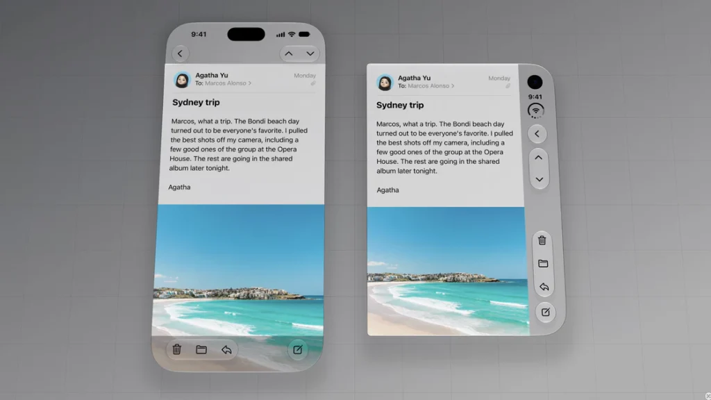
For a device that doesn’t boast a tall profile, Duo—in an effort to conserve its already limited vertical space—relocates numerous app controls and buttons (such as “Back” and toolbar items) from the top and bottom edges to the right side of the screen. This creates a unified vertical “Control Area” designed for quick access with the right hand, while the app’s main content automatically shifts to the left to avoid this zone, maintaining a balanced aspect ratio. In most scenarios, the two areas remain distinct, each serving its specific purpose.
To be honest, this design logic sounded perfectly sound, logical, and even ingenious during the launch event.
But when I actually updated the Xcode Simulator and got hands-on with Duo for the first time, only one thought crossed my mind:
Apple has finally come for the people with OCD.
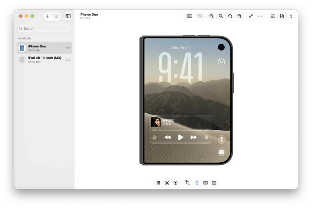
The inherent visual imbalance of the D-shaped screen is further amplified at the software level. Elements that intuitively belong in the center—such as the clock, cards, and notifications—are shifted to the left-hand content area on the Duo’s outer screen; meanwhile, the home screen, apps, and various usage scenarios encountered after unlocking all perpetuate and exaggerate this visual asymmetry.
As an iPhone user with a high capacity for adaptation, I initially thought I simply needed time to adjust—telling myself, “Apple must have a good reason for doing this.”
However, upon closer analysis, I realized that these layout changes affect more than just visual balance, and the “victims” aren’t limited to those with OCD. They threaten to disrupt established user habits, lead to inefficient space usage (robbing Peter to pay Paul), and even cause the newly introduced “Liquid Glass” design language to feel occasionally out of place.
In the following sections, I will break down and analyze these experiential issues.
What are the most valuable assets of an operating system?
People might cite the ecosystem, app quality, or hardware-software integration… but there is an invisible asset that often goes unnoticed: user habits.
When trying out a brand-new app on an iPhone, we rarely need to learn how to use it. Most apps follow a universal design paradigm: title bars at the top, navigation at the bottom, “back” gestures on the left, and “more” menus on the right. You don’t even need to know exactly what the buttons look like; your fingers naturally know where to reach when using the device.
These are all “interaction intuitions” cultivated by the operating system.
Yet, the Duo subjects this set of habits—deeply ingrained in our muscle memory—to its most radical overhaul.
Frame 11
As previously mentioned, functional buttons that were originally distributed across various positions and hierarchy levels within an app are all crammed into the right-hand control area on the Duo. Furthermore, due to the limited horizontal space in this right-hand zone, buttons that previously relied on a combination of “icon + title” (such as bottom navigation) are forced to shrink into icon-only representations. The resulting shift in user experience is this: previously, when using an iPhone, your intuition naturally guided you to the right spot to activate a function; now, however, you have to pause and scan the side panel to locate the specific function before daring to tap—or, in many cases, you might not even be able to distinguish what the icons represent.
After all, the utility of icon-only interfaces has always had its limitations.
Frame 12
For frequently used, universal buttons like “Back,” “Share,” or “Search,” a shift to the side panel is easily recognizable at a glance. However, once you enter third-party apps, you encounter a multitude of custom functions or niche operations that lack standardized, universally understood iconography. Without text labels, you are forced to guess the function of certain icons. It feels a bit like opening Photoshop for the first time and looking at the toolbar on the left: a row of buttons that all look useful, yet whose specific functions aren’t immediately obvious. The same logic applies to Duo’s side control area.
Consequently, getting lost or accidentally triggering the wrong function will likely be challenges this design system faces in its early stages. These issues translate into a steeper learning curve and a higher cost of adaptation for the average user. As for whether Duo’s side control area offers a significant enough improvement in user experience to offset these costs—that remains to be seen once people have actually used the device for a few days.
A design born to “save space” ends up creating a new kind of space wastage.
Another contradiction in this design scheme lies in the handling of “space”—which is also my biggest question regarding the design of Duo’s external display.
One of Apple’s key reasons for moving controls to the side was to free up the top and bottom areas, thereby allowing content to occupy more vertical space.
Frame 13
While this logic is sound in isolation, the issue is that spatial efficiency is not defined solely by vertical height.
A major benefit of the “wide-format foldable” form factor is the expansive viewing field and enhanced sense of immersion it offers. Yet, on the iPhone Duo, the control area on the right becomes a “reserved zone” permanently allocated to floating controls. Even on pages with few buttons or minimal functionality, this area remains set aside, and standard content cannot freely encroach upon it. Consequently, a significant portion of the space on the right side of the screen effectively becomes “negative space reserved for controls.”
Frame 14
To put it in comparative terms: when folded, the iPhone Duo’s body width is approximately 1.16 times that of the iPhone 18 Pro, making it feel noticeably wider and more of a stretch to hold in daily use. Yet, in most usage scenarios, the effective horizontal space available for displaying content on the outer screen is only 0.94 times that of the iPhone 18 Pro. In essence, despite the wider body—and on top of the already limited vertical height—there is no gain in actual display area. Only in a few immersive scenarios—such as viewing photos or videos, or within app layouts that support horizontal scrolling—can content truly fill the entire screen.
Furthermore, when switching to the inner screen, the issue of a left-leaning layout and visual imbalance—caused by that side-mounted control zone—continues to loom over the Duo experience.
Frame 15
Liquid Glass is a window; the Duo has built a wall behind it.
The third flaw lies in a regression of the Liquid Glass concept and a failure to deliver its intended tactile quality.
I have always believed that the most valuable aspect of Liquid Glass isn’t just the exquisite, beautiful texture of the glass itself, but how it redefines the relationship between app content and the overlaying controls.
Frame 16
In the past, elements like toolbars and navigation bars typically occupied distinct UI zones, taking up significant screen real estate. Liquid Glass, however, uses semi-transparent materials and floating controls to allow content to extend seamlessly behind the controls.
On one hand, this visually expands the content’s reach, enhancing immersion. On the other, the underlying content acts as an “ambient light source” for the glass controls above; through refraction, blurring, and shifts in light and shadow, it gives Liquid Glass its truly beautiful, premium texture.
Frame 17
Thus, the beauty of Liquid Glass stems largely from the “content” behind it. The photos, text, and colors obscured by the controls ultimately serve as the “background music” for the glass, giving it a truly luminous, translucent beauty. However, with the iPhone Duo, things suddenly became awkward.
The underlying content and the overlaying controls—which had barely begun to enjoy a harmonious synergy—were forced apart once again. A multitude of “Liquid Glass” buttons had to be detached from the content area and relocated to a blank sidebar on the right.
Figure 18-2
It was as if Apple had just used a brand-new design language to tear down the wall between the “content area” and the “control area,” only to build that wall right back up for the Duo. Moreover, with the glass backing stripped of dynamic content and left blank, the very qualities that made it shine—its refraction, play of light and shadow, and sense of depth—lost the stage they needed to truly impress.
In short, it falls short of the original “Liquid Glass” aesthetic.
Why did Apple choose this design?
Having discussed the design “regressions” of the iPhone Duo at length, a question naturally arises: Why did Apple insist on this approach?
Let’s engage in some pure product speculation here—after all, outsiders cannot know the actual decision-making process Apple went through. However, if we attempt to reverse-engineer the design logic, I suspect a key reason lies in the timing gap between hardware finalization and software design.
For a high-precision device, the internal structure, screen specifications, hinge mechanism, and component layout often need to be locked in quite early.
Figure 19
If the Duo’s screen aspect ratio and external display shape were essentially finalized before full-scale software design began, the UX team wasn’t asking, “How do we design the ideal external screen experience?” Instead, they were facing a fixed “D-shaped” screen and asking, “How do we make this look intentional?”
One way to tackle this head-on was to deliberately assign it exclusive functions (much like the Dynamic Island). Consequently, an asymmetry stemming from the hardware structure was leveraged and reinforced on the software side, evolving into a brand-new interaction paradigm. This paradigm, in turn, provided functional justification for the unique hardware form. The two elements supported each other, ultimately presenting a cohesive “hardware-software integrated design” to the user. From this perspective, the design has its merits. However, the solution itself has created a new set of problems, as mentioned earlier.
Apple has been most conservative with the most crucial capability for large screens.
Next up is the aspect I care about most, aside from design: multitasking.
Apple has long led the way in multitasking experiences on iPad and Mac platforms. Split View, Slide Over, Stage Manager, free-form windows—users can essentially choose whatever configuration suits them, and even the compact iPad mini supports them all.
Render of iPad Stage Manager
That’s why, before the Duo was announced, I was curious: how would Apple pack these capabilities into a foldable device?
Yet, Apple’s answer turned out to be quite conservative: it supports only the most basic Split View. There is no support for split-screen on the outer display, no vertical (top-and-bottom) split-screen, and no adjustable split ratios… let alone any mention of Stage Manager or free-form windows. Compared to the fiercely competitive multitasking experiences currently found on Android, I have to say: what Apple has provided is simply too little.
It reached the point where watching media hands-on videos repeatedly demonstrate the Duo’s split-screen capabilities felt like watching someone marvel at the fact that “this foldable actually folds.”
Frame 20
Regarding the work of bringing iPad multitasking capabilities to foldables, Apple’s approach is:
It’s not that they won’t do it; they are taking it slow—prioritizing quality and a methodical rollout… saving it as a selling point for the next generation.
Having covered the software, let’s turn back to a few small details regarding the hardware design.
The first is the placement of the front-facing cameras.
Currently, the Duo’s outer front-facing camera is positioned near the top-right corner of the external screen, while the inner under-display camera is centered at the top of the right-hand screen—a rather peculiar layout.
Frame 9
Let’s start with the inner screen.
First, regarding the inner under-display FaceTime camera: according to media tests, the image quality is barely usable. The primary goal of sacrificing image quality for an “under-display” design was simply to minimize the camera’s visual presence as much as possible. However, due to the nature of the material coating, it cannot achieve true invisibility; in fact, it remains quite noticeable from certain angles.
Returning to the original design goal—minimizing visual distraction—shifting the under-display camera further to the right, toward the screen’s edge, so it ultimately serves as the background for the new side status bar, might be a more logical solution.
Frame 21
As for the external screen, the “right-aligned camera,” “asymmetrical screen shape,” and “side control zone” have essentially become an integrated layout trio. Many of the design flaws analyzed earlier are directly linked to this specific layout configuration.
Frame 9-6
Therefore, a different approach—keeping the external screen camera centered and restoring a more symmetrical screen profile—might be a viable alternative. This change would allow app layouts to return to a centered, full-screen format, move the status bar and control buttons back to the top, and restore the immersive “Liquid Glass” aesthetic.
While this alternative design might seem unexciting or even old-fashioned—lacking the novelty of a fresh layout upon waking the screen—it would likely offer a more user-friendly experience for the majority of people.
Beyond the placement of the selfie camera, another debatable hardware design choice on the iPhone Duo is the location of the charging port.
The iPhone Duo appears to be the industry’s first foldable phone to place the charging port on the “left half” of the screen; without exception, other horizontal-folding phones on the market place the port on the right half. Initially, I hadn’t considered the significance of that common design convention, but the Duo made me realize something: when the Type-C port is on the left screen, opening or closing the device while it is plugged in causes the cable to swing back and forth along with the movement of the phone body.
iPhone Duo opening/closing
Of course, this is hardly a critical design flaw, and the average user certainly wouldn’t view a swinging charging cable as a major issue. However, what struck me as a striking contrast was this:
Apple invested immense effort into the software, meticulously refining the seamless visual transitions of the UI during the opening and closing actions. They made the display elements appear anchored to a fixed spatial position—a touch of that signature Apple-style polish. Yet, when it comes to the physical realm, the device tolerates a tangible, glaring cable that swings back and forth through the air as the device opens and closes. That carefully crafted sense of spatial consistency from the digital world is abruptly shattered the moment it meets physical reality… I wonder if the Apple software team finds this disheartening.
iPhone Duo Opening/Closing Animation
In any case, the opening and closing animations of this year’s iPhone Duo deserve praise; they are executed with exquisite detail and represent the aspect that best conveys “Apple Design” to users. One could even say that these animations preserve a necessary touch of dignity for the Duo’s software experience.